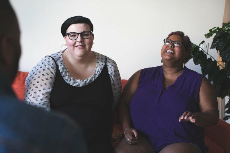
The Power of Deep Navy
Navy blue has earned its reputation as one of the most universally flattering colors in plus size fashion, and recent research backs this up completely. Clothing colour black and red attracted the highest body attractiveness and slimmer body size ratings, but navy follows closely behind in creating an elongating effect. This deep, sophisticated hue works like visual magic by creating a continuous line that doesn’t break up the body’s silhouette. Navy pairs beautifully with almost everything in your closet, from crisp white shirts to vibrant scarves, making it the ultimate workhorse color.
The psychological impact of navy can’t be ignored either. Universally, studies show that blue is both men and women’s primary preferred color. One study dove into why blue is so popular and found that it’s associated with clean water, clear skies, authority, truth and tranquility. When you wear navy, you’re projecting confidence and reliability while looking effortlessly put-together.
Classic Black Never Fails
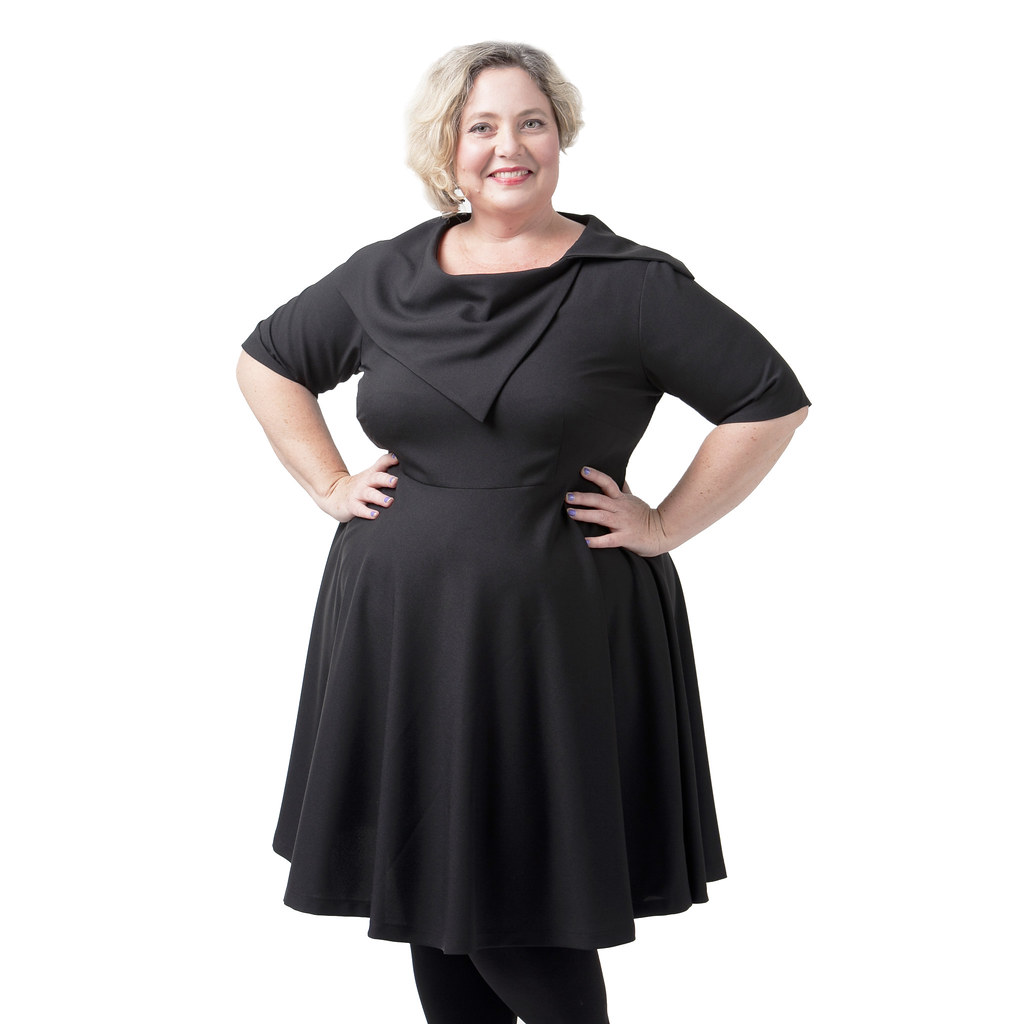
There’s a reason black dominates plus size wardrobes everywhere, and it’s not just about playing it safe. Scientific studies reveal that clothing colour black and red attracted the highest body attractiveness and slimmer body size ratings, making it a proven winner for flattering appearances. Black creates clean lines and helps define your shape without adding visual weight to your frame. It’s the chameleon of colors, transforming from day to night with just a change of accessories.
What makes black especially brilliant for plus size fashion is its versatility in creating monochromatic magic: single-color ensembles create a sleek, unified look that’s both sophisticated and visually appealing. You can layer different textures and fabrics all in black for depth without compromising the streamlined effect. Think black jeans with a black turtleneck and a black blazer – instantly chic and pulled together.
Rich Burgundy and Wine Tones
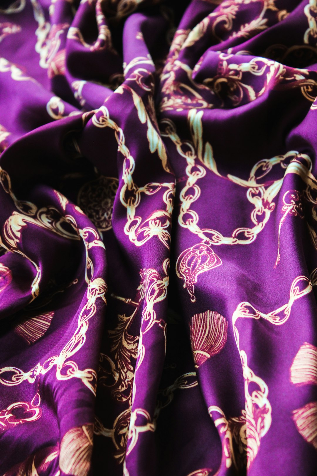
The fashion world has been buzzing about deeper red tones, and Victoria Beckham, Saint Laurent, and Sergio Hudson featured darker shades of red during their fashion show. While designers like Carolina Herrera, Christian Siriano, and Ferrari featured a variety of bright reds. These are a few deeper toned reds that will create some chic fall outfits. Burgundy and wine colors offer all the sophistication of black with a touch more personality and warmth.
These rich red tones work particularly well because they’re not as attention-grabbing as bright red, but they still add visual interest to your outfit. They complement a wide range of skin tones and pair beautifully with neutrals like cream, gray, and navy. The psychological effect of red is powerful too – it’s the color of passion, power, love, and danger all at once, a psychological primary that quickens the pulse. After a decade where millennial pink and other softer tones often stole the spotlight, red is reminding us of its timeless allure.
Emerald and Forest Green
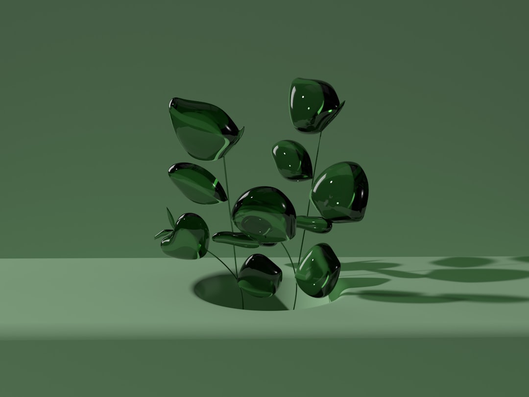
Green might seem tricky, but the right shades can be absolutely stunning on plus size figures. Martini olive green, a muted emerald that’s reminiscent of the Castelvetrano olive that comes submerged in a dirty martini. Gucci’s fall/winter 2024 collection is where we first glimpsed the color, and it’s only grown stronger in the spring/summer 2025 collections. Since it pairs so well with black, white, beige, and gray, it’s set to be one of the most wearable colors of the whole season.
The key is choosing deeper, more muted greens rather than bright kelly or lime green. Forest green, emerald, and olive tones create a rich backdrop that’s both earthy and elegant. These colors work especially well in structured pieces like blazers or wrap dresses where the sophisticated hue can really shine. Plus, green has positive psychological associations with growth and nature, making it a refreshing alternative to typical neutrals.
Sophisticated Gray Tones
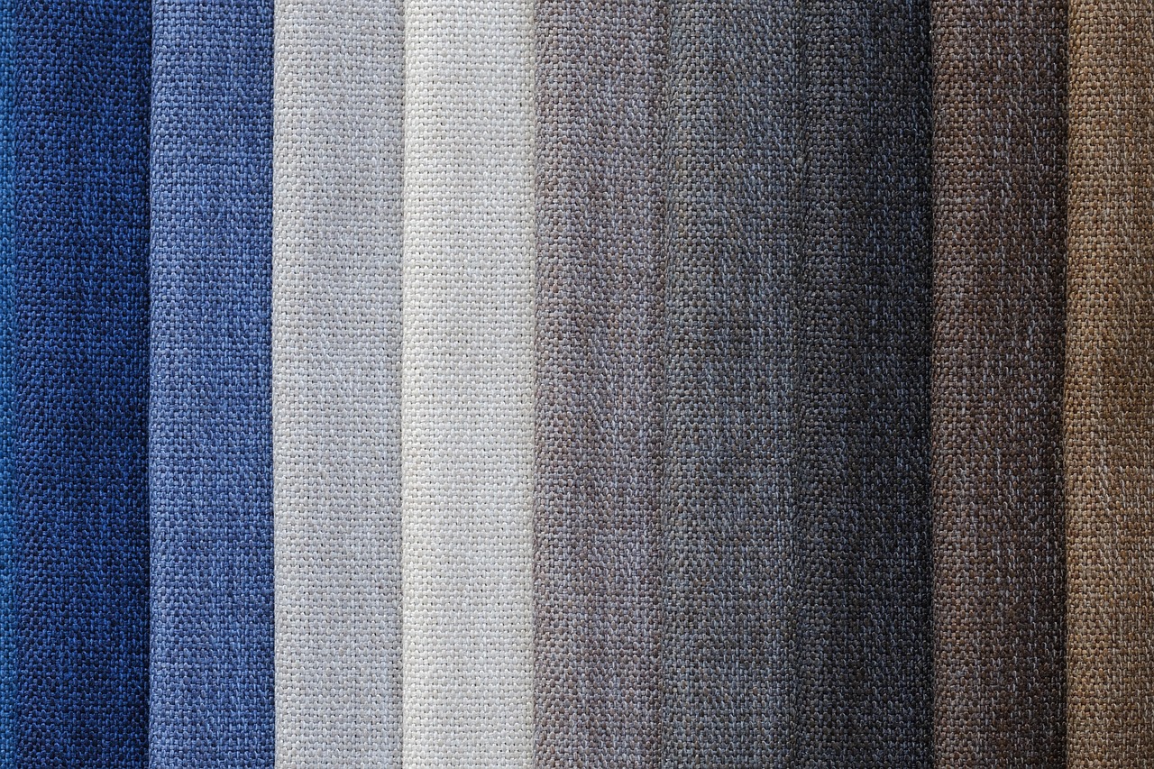
While some research suggests that green and grey induced the lowest body attractiveness and overestimated body size judgements, the key is in choosing the right shade and styling it properly. Charcoal gray, warm gray, and pewter tones can be incredibly flattering when done right. The trick is avoiding colors that wash you out and instead choosing grays with undertones that complement your skin.
Gray works beautifully as a neutral base that’s softer than black but more substantial than beige. It pairs wonderfully with jewel tones and can create interesting monochromatic looks when you layer different shades together. Think of a light gray sweater over charcoal gray pants with pewter accessories – it’s subtle sophistication at its finest.
Soft Pastels Done Right
Pastels might seem intimidating for plus size figures, but back in December of 2024, Pantone announced that mocha mousse is the color of 2025. It’s a beautiful color and all, but honestly, I’m seeing more pastel pinks from designers and retailers for spring 2025. Think powder pink, blush pink, and petal pink. And think of these shades as a neutral. The secret is choosing muted pastels rather than bright, candy-colored versions.
Soft pastels like dusty rose, sage green, and powder blue can be incredibly flattering when styled correctly. The impact of Barbiecore can’t be overstated and while hot pink may be shimmying out of the spotlight for now, an onslaught of designers are embracing a gentle tea rose hue in 2025. From Khaite’s dreamy dresses crafted in powdery pink swaths of silk gazar to Simone Rocha’s and Ferragamo’s ballet-adjacent, petal pink separates. These softer versions create a feminine, approachable look without overwhelming your frame.
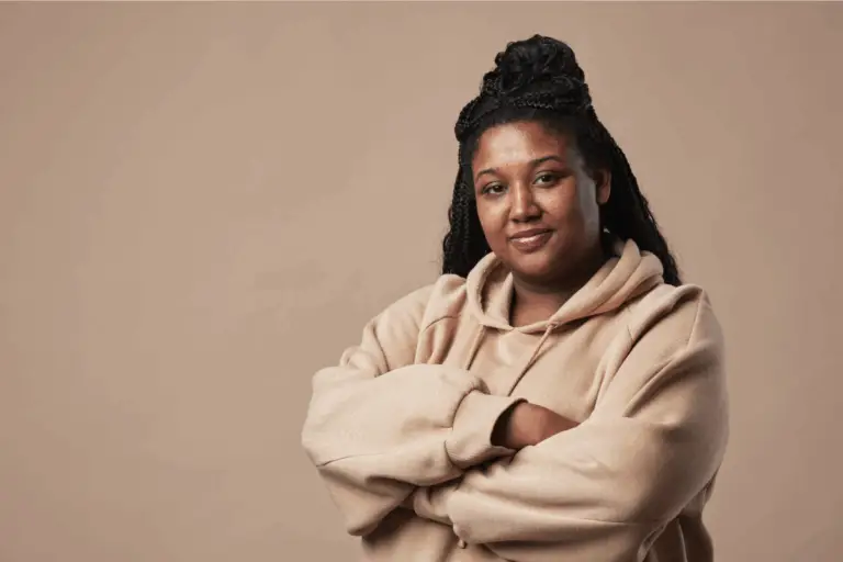
Warm Earth Tones
Earth tones are having a major moment in plus size fashion, and for good reason. Rich, chocolate brown will play a starring role in 2025. This timeless neutral is among the easiest to style and manages to feel a bit more refined than a simple black or charcoal gray. Look to runways like Max Mara for inspiration on how to wear it. Colors like chocolate brown, camel, rust, and terracotta create warmth and richness that’s incredibly sophisticated.
These earthy hues work particularly well because they’re grounding and substantial without being harsh. They complement a wide range of skin tones and create interesting combinations when paired together. Think of a camel-colored coat over a chocolate brown dress with cognac accessories – it’s like wearing autumn in the most elegant way possible. Meet cashew milk – a warm cream that’s not quite white but also not quite beige. This milky shade appeared in some of the season’s most elegant looks.
Jewel Tone Brilliance
Jewel tones like sapphire blue, amethyst purple, and emerald green can be absolute show-stoppers in plus size fashion when chosen thoughtfully. These rich, saturated colors create depth and luxury while remaining surprisingly wearable. According to research, purple and turquoise are generally liked among most women. Turquoise is a combination of both blue and green, which are in the top 3 colors for women across multiple studies. Turquoise and purple are also across from each other on the color wheel, making them complementary colors, which creates a very pleasing palette.
The beauty of jewel tones lies in their richness and depth. They’re sophisticated enough for professional settings but vibrant enough to make a statement. A sapphire blue blouse can elevate a simple black suit, while an amethyst sweater adds luxury to casual jeans. These colors photograph beautifully and never look cheap or washed out.
Strategic Color Psychology
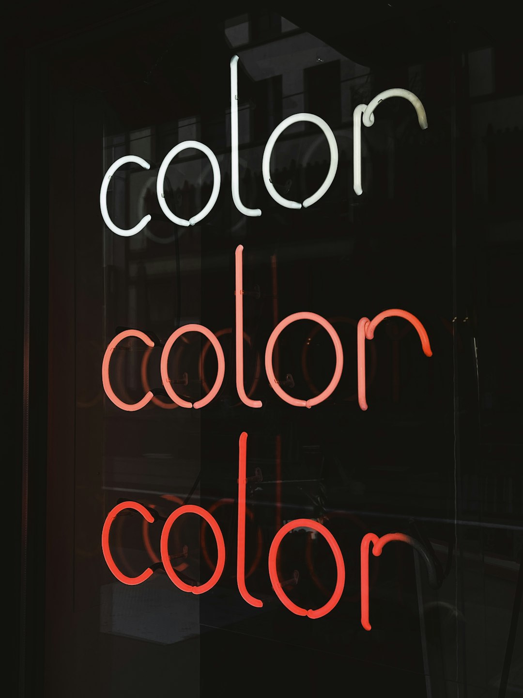
Understanding the psychological impact of color choices can help you dress with intention and confidence. Color alone can influence up to 90% of first impressions and affect 85% of consumer purchase decisions, making your color choices incredibly powerful. The Dress to Impress page helps you harness the emotional power of color psychology to make the right impression – whether you’re heading to a job interview, attending a party, or going on a date. This feature presents curated color groupings from your seasonal palette, organized by emotional goals and real-life scenarios. Each section is titled according to the impression you want to create, such as Take Me Seriously or I’m Happy!.
Different colors communicate different messages, so choosing strategically can help you achieve your goals. Navy communicates trustworthiness and professionalism, making it perfect for business settings. Rich burgundy suggests confidence and sophistication, while soft pastels convey approachability and femininity. The psychological associations of color in fashion design are also vital in establishing a connection with target audiences. For example, blue is often associated with trustworthiness and stability. Green, on the other hand, might be used to suggest a connection to nature or growth.
Colors have the power to transform not just how others see you, but how you feel about yourself. The most consistently flattering colors for plus size styles aren’t about hiding – they’re about highlighting your best features and expressing your personality with confidence. Whether you choose the timeless elegance of navy, the sophisticated warmth of chocolate brown, or the bold statement of jewel tones, the right color can make you feel unstoppable. What color makes you feel most like yourself?